Weightmans Website
Needs writing
Praesent vitae porta nunc. Etiam accumsan varius cursus. Proin eu leo faucibus, luctus eros id, ullamcorper ligula. Vestibulum eu sagittis quam. Fusce condimentum ac augue id volutpat. Duis venenatis, enim eget lobortis mattis, arcu ligula maximus nisl, ac elementum quam massa sit amet diam. Donec ac felis non lacus suscipit condimentum at ut enim. Nunc id egestas massa, in suscipit ante. Nunc quis fermentum nunc.
Our challenge.
Praesent vitae porta nunc. Etiam accumsan varius cursus. Proin eu leo faucibus, luctus eros id, ullamcorper ligula. Vestibulum eu sagittis quam. Fusce condimentum ac augue id volutpat. Duis venenatis, enim eget lobortis mattis, arcu ligula maximus nisl, ac elementum quam massa sit amet diam. Donec ac felis non lacus suscipit condimentum at ut enim. Nunc id egestas massa, in suscipit ante. Nunc quis fermentum nun.

Some writing here about UX challenges and problems to resolve with the old site? How we did wireframes plus a UI guide.


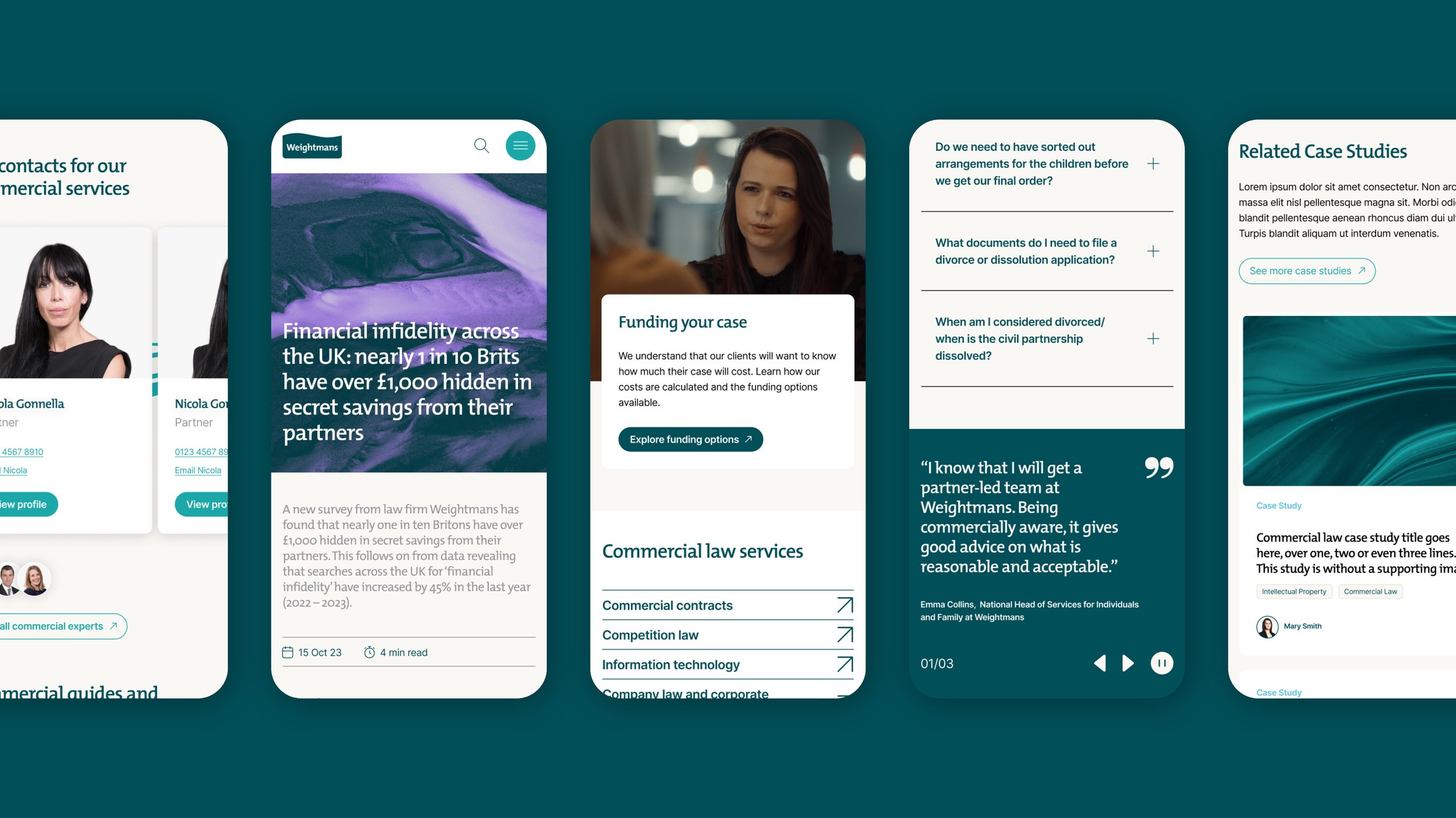
An important early UX task was creating a tiered primary menu design that could flex depending on menu content. Each parent area of the site had vastly different children levels below - from 3 simple subpages under careers to 50+ children pages under services. We settled on a multi layer approach combined with concertina links for the complex subservience levels.
At the bottom of the site we implemented a playful element into the new site footer, with a wave animation being activated on scroll as you reach the bottom of the page. This references the established brand but with a fresh lighthearted twist.